The other day, I realised that I talk to you about classic style interiors all the time, but I’ve never explicitly shared the characteristics that make a space “classic”. For example, if you browse through our portfolio, you might notice that every space has that classic, timeless feel — no cold, modern homes here! And yet… they’re all distinctly different, reflecting the lifestyle, tastes, and personalities of the homeowners.
So, what features make these spaces classic? How can you adopt those styles into your own home but tailor them to your unique taste?
Today, I’m sharing the top 7 key design elements of classic style interiors, along with several examples to help you see these elements in action and tips for embracing them beautifully.
Element #1: Classic Style Architectural Details
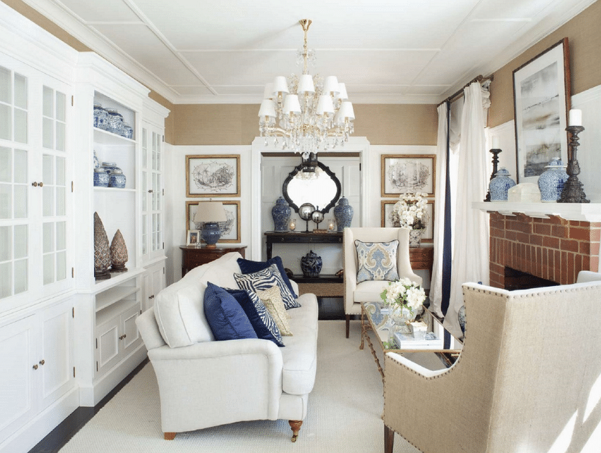
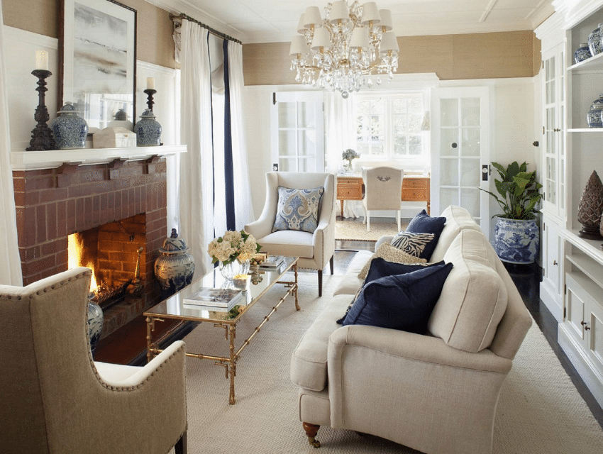
Perhaps the most obvious trait of classic style interiors is their architectural detail. These can be features like moulding, architraves, skirting boards, wainscot paneling, and other custom joinery from the walls to built-in fixtures (like the unit above) to your fireplace and even ceilings.
If you have a beautiful heritage home brimming with character, you will have no shortage of architectural details to preserve, freshen up, or accentuate. If you own a newer, more modern home, adding bits of architectural detailing can infuse classic style into the home quite effectively.
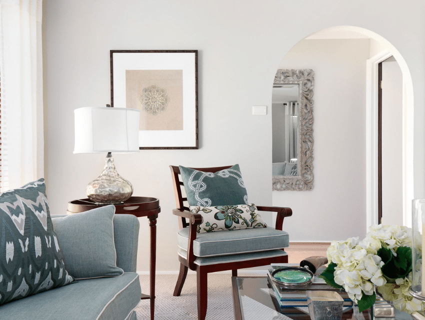
Arched doorways and minimal mouldings bridge classic style furnishings in a house with more modern-style architecture. From our Chisholm Decorating Project.
Element #2: Layering in Classic Style Interiors
Nearly every aspect of a classic style home involves some sort of layering, from your colour palette to your textiles to the way you arrange furniture and decor. Layering is essential to create a feeling of comfortable luxury — whether the home is high-end or not.
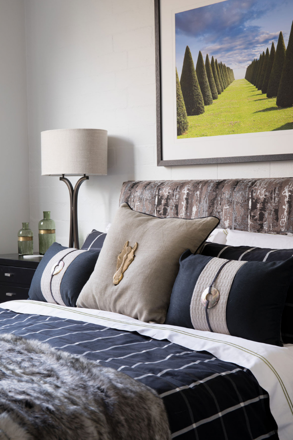
Layered pillows, fabrics, and tones of taupe, white, and navy, creating a cosy yet masculine guest room. (From the Kingston Bachelor Pad.)
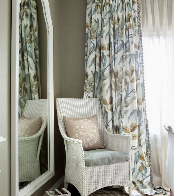
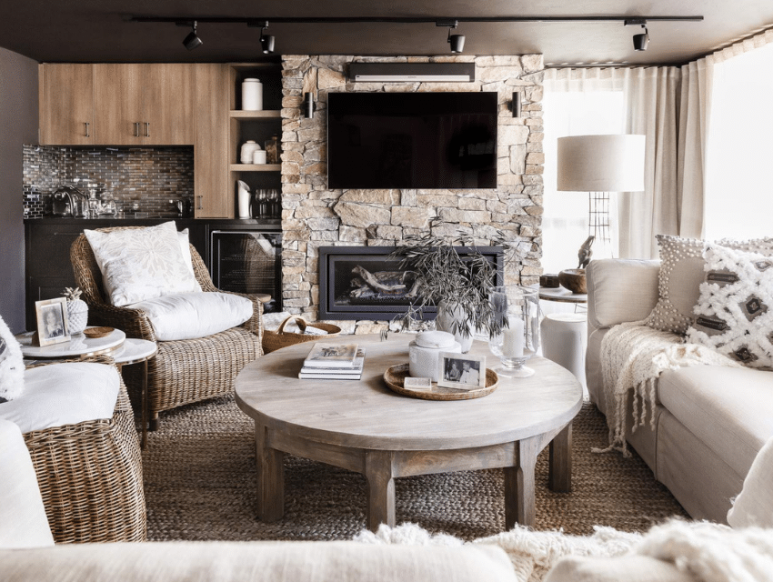
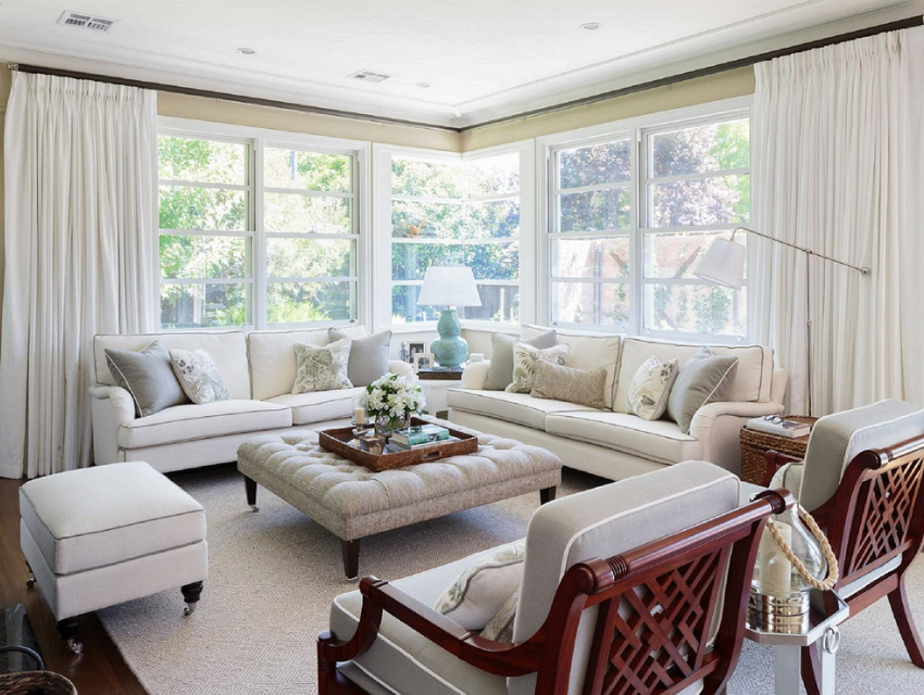
Layered creams, textiles, natural materials (like wood, wicker, and stone) create a Rumpus Room in Deakin that feels comfortable, indulgent, and delightfully approachable.
Element #3: Embracing Luxurious Textiles
Another feature of classic style homes can be found in the materials used to create the space, namely layering luxurious textiles. Textiles are what make classic spaces feel soft and inviting, even if the overall design leans in a masculine direction.
Some great textile options for mixing comfort and luxury: velvet, linen, leather, cashmere, hides and fur (or faux versions), wool, and silk.
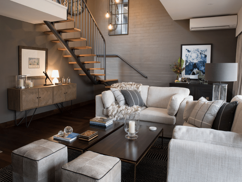
A distinctly masculine space, the living room of the Kingston Bachelor Pad feels anything but austere. The cosy textiles of the sofas, ottomans, pillows, drapery, and blanket make the room a welcome, comfortable, and classic retreat.
Element #4: Depth of Colour in Classic Style Interiors
Similar to textiles and layering, a colour palette with visible depth is essential to a classic style space. Though we tend to see more neutrals in a classic design — whites, creams, beiges, taupes — even bolder colors can be used effectively when depth and dimension are also present, such as blues, darker navy, and earthy shades of red, green, or brown. Here are a few examples…
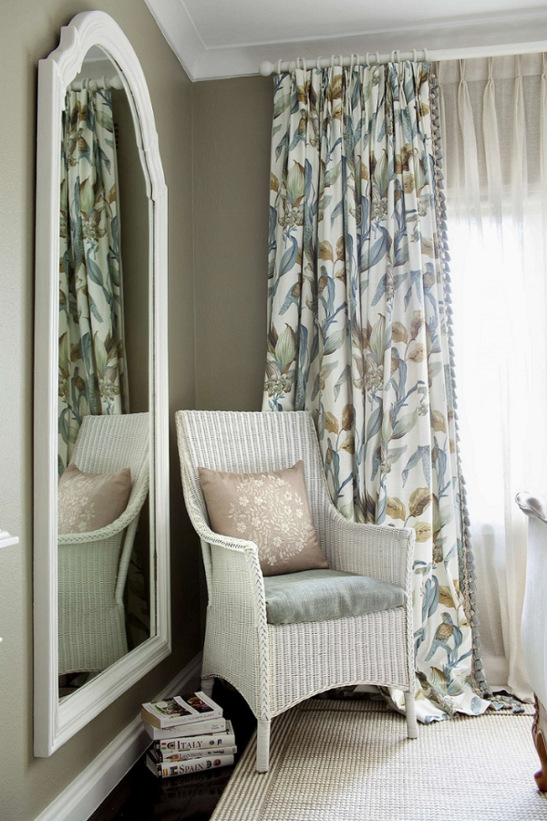
This Classic Style Bedroom is doing everything right — architectural details, layered textiles, and a palette of sage, bronze, and blue. The effect is joyful and airy, leans in a feminine direction, and is undeniably classic.
Grab the Hamptons Colours for Canberra Homes Guide
To achieve a Hamptons colour scheme, download my free guide to Hamptons colours.
Drop me a line and let me know how you go!
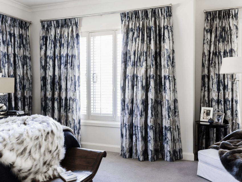
Here’s another example of colour use in this Master Bedroom in Deakin. A light, neutral base supports dark wood furniture and luxurious drapes in navy blue and grey. This room uses the colour palette to balance masculine and feminine, feeling luxurious, comfortable, deep, and spacious.
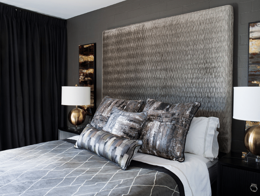
I can’t resist… here is yet another Classic Master Bedroom with an entirely different palette. We layered shades of gray, bronze, and black for a fully masculine space with no shortage of comfort.
Element #5: Multiple Patterns
In the photos so far, you’ve seen several spaces where we’ve mixed multiple patterns. (Look at the pillows on any sofa or bed!) There are a couple reasons why multiple patterns are an important design element in classic style homes.
First, the right combination of patterns establishes visual depth, which contributes to that layered, comfortable feel I mentioned earlier. Second, pattern play is interesting to the eyes. Patterns with some “movement” in them can transform a plain space into one that feels fresh and lively. The Master Bedroom above is a great example, as well as our 1930s Canberra Bungalow:
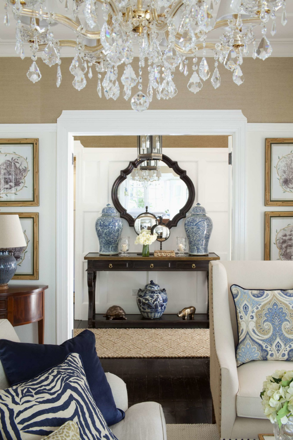
Patterns in paisley, zebra, cheetah (and even the patterns on the ginger jars!) break up the neutral foundation of the space and inject some liveliness.
Element #6: Upholstered Seating
Upholstered seating is another important aspect of classic style design. Yes, this feature goes along with my point about luxurious textiles, but it deserves a spot all on its own — it’s usually the main attraction in a classic style space!
You will often see shaped lounges, handsome wingback chairs (pictured above), upholstered benches and ottomans, and more. These pieces incorporate several elements of classic style all at once: classic detailing in the woodwork, luxurious textiles in the upholstery, and an overall feel of comfort and livable elegance.
Another space that incorporates all of classic style design elements in one place! From the Hamptons-inspired living room design in Reid. The upholstered, button-tufted “coffee table” is both stunning, classic, and functional.
Element #7: Symmetry & Balance
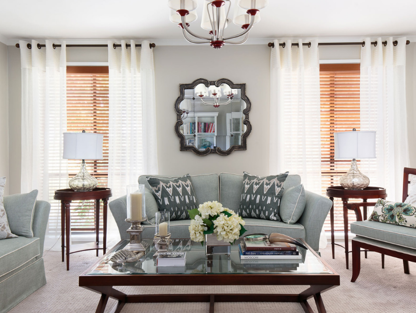
Last but not least, classic style design is rooted in symmetry. From the way we style mantels and bookshelves to your furniture placement, symmetry is timeless. It brings order to the room… and I think you can probably agree that order feels comfortable, inviting, and easy on the eyes.
A perfect example of symmetrical styling, from the layered drapery to the furniture plan. From the Chisholm Decorating Project.
Symmetrical styling on this entryway console and the wall leading to it!
Well, there you have it, my house-proud friend. Seven elements of classic style design and various ways to implement them beautifully according to your own unique lifestyle and sensibilities.
If you’re ready to create your own classic style forever home, be sure to get your hands on our Design & Decorating Project Planner. It will guide you on your way and help you prioritise the best next action steps on your journey.
Until next time,
Nadine

