Colour is one of the most difficult aspects of a decorating project to nail down. Or a renovation project, for that matter. Finding the perfect combination of materials, fabrics and furnishings is an art mastered over many years. (Believe me, I’ve put in the time.) And yet… your colour palette is often the foundation of your entire design. It is essential to get right!
Although your best strategy is to work with an expert, I thought I’d share my own tried and true method of creating colour palettes for classic interiors. Step by step, I’ll lead you through the colour process, and at the end, if you need assistance, I have a quick solution I think you will find quite helpful. Come take a look-see…
Step 1: Identify What’s Staying in the Room
By “what’s staying”, I mean the fixed elements or furnishings in your home that we’ll need to account for with the colour palette. For example, do you have Canberra Red brick that needs to fold into the scheme? Or perhaps you are working with a terracotta floor? What about existing joinery or timbers?
Whatever isn’t changing is the starting point for your scheme. Although you may be tempted to ignore them and carry on, a cohesive colour palette requires us to acknowledge and accommodate all of the voices in the room.
 In my 1930s Canberra Bungalow, this red brick fireplace is a fixed feature that had to be accounted for when creating the colour palette.
Step 2: Find Your Colour Inspiration
Have you been grabbing inspirational photos from Pinterest or the like? Even better, have you spotted some photos that inspire you and include the colours of features you already have? (Like that red brick.) If so, you are on the right track and you can move on to Step 3.
Or, perhaps you have a few inspirational photos that are polar opposites and you can’t eliminate any yet? What do you do? Well, gather up another 50 inspirational photos (Pinterest) and take another look at the lot. You will now be able to see a trend for what you really like. Start there.
Step 3: Select Your Main Colours
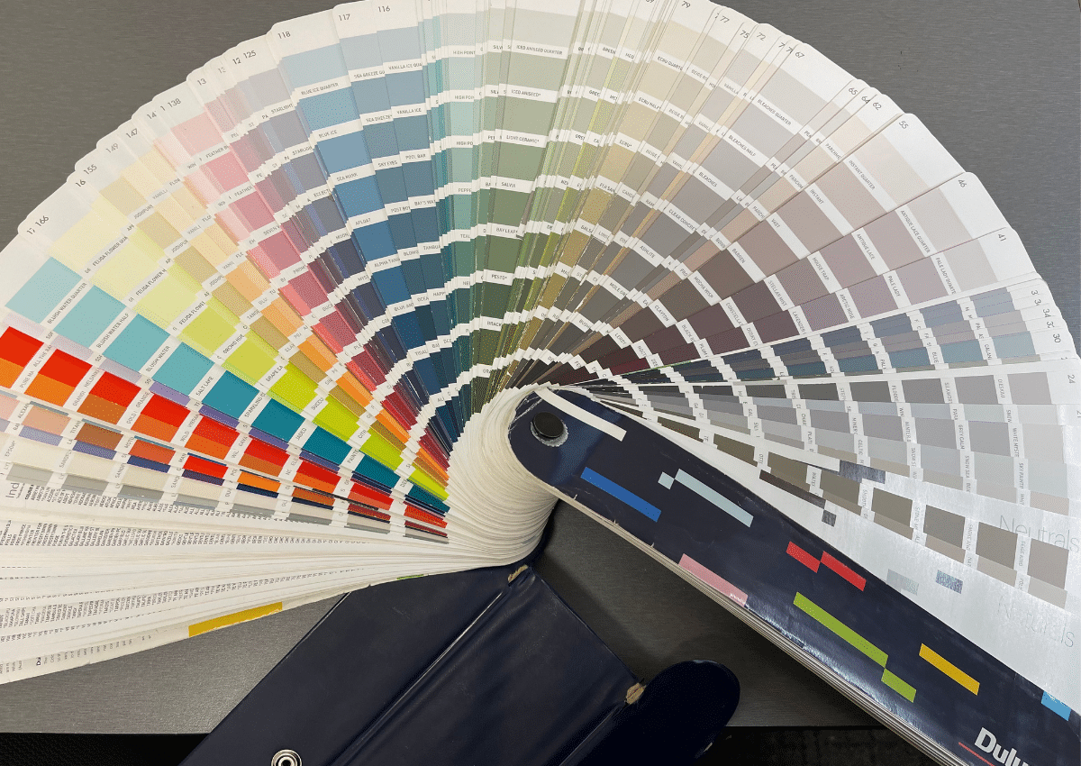
When I work colours with clients, I like to spread out the fan deck (shown above) to show the huge range of colour possibilities. You might try this standing in front of the wall of samples in Bunnings. You will quickly see what area you gravitate to and what jars you.
We then start by identifying colours in the inspiration photos, or in the features that are staying. We can quickly eliminate colours we don’t want, which are usually the highly saturated colours on the left. When it comes to “neutral land” (on the right), you can see the shift as we move from more grey to more brown. If a colour looks very light neutral at the top, you can track it down to it’s darker shade below. This is the tinge it will throw when used in mass amounts.
Once you have your base colour selected, you can start creating a colour palette…
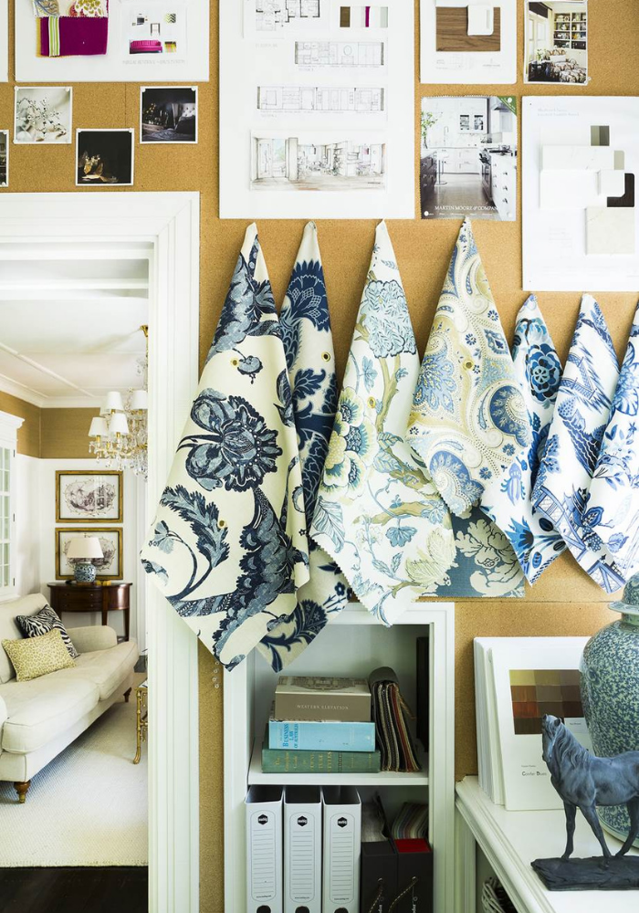
Step 4: Combine Swatches to Create Pleasant Combos
I think the magic happens when we start combining swatches to create pleasant combos. I can pick out a few swatches in the fan deck and move the rest away to see how those colors interact together.
There are no right answers, but colour tips for classic design are to highlight big skirtings and elevated joinery with bright white or dark lacquered colour. For wall colours, always go a bit dirty looking when it comes to colour — counterintuitive, I know — because it gives the room a softness that is easy to live with. Many grey homes around Canberra feel a bit cold and hard and could have benefited from a bit more brown in the grey mix. I can see they had their idea, but it’s where executing the nuances with an expert comes into play. (Which is exactly what we help you do in our Designer for a Day service!)
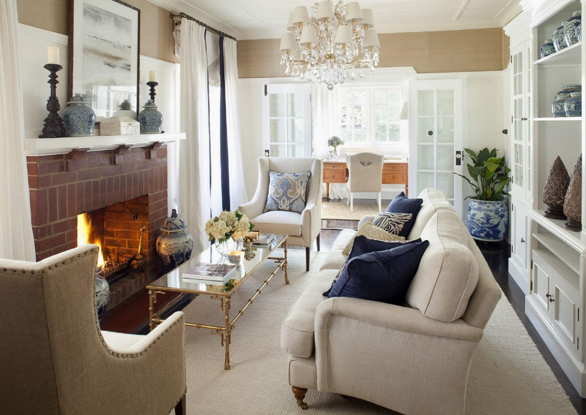
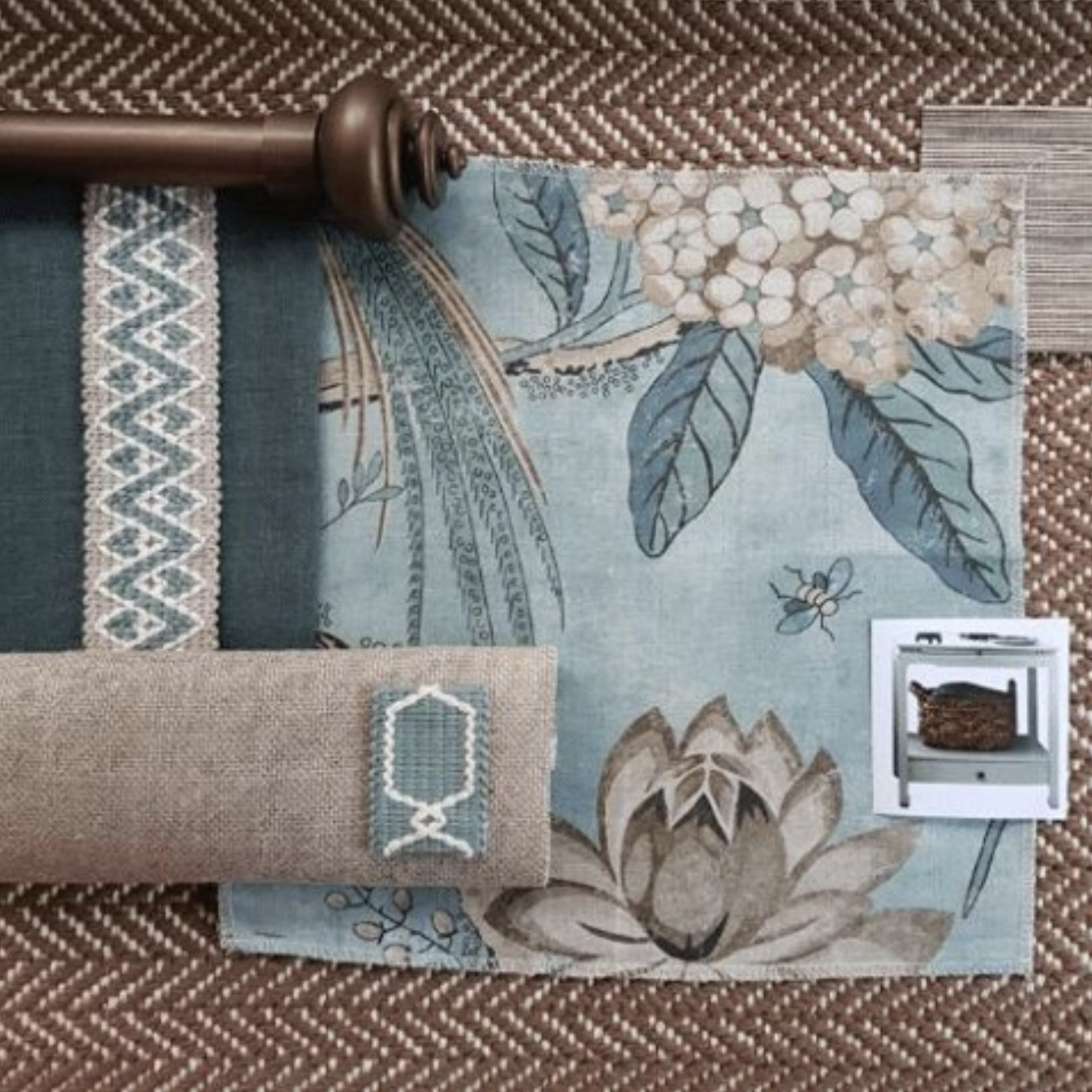 The colour palette behind this mix of fabrics and materials included warm brown, teal in a darker and lighter shade, beige, and a white with a warm undertone.
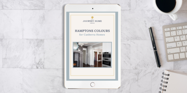
Grab the Hamptons Colours for Canberra Homes Guide
To achieve a Hamptons colour scheme, download my free guide to Hamptons colours.
Drop me a line and let me know how you go!
Step 5: Test Your Colour Palette at Various Times of Day
Once you have settled on a palette option of two, try viewing them in the space in your home where they will be incorporated. Look at the way the colours interact with each other in the morning, at midday, at sundown, and in the evening when artificial lights are on. I particularly like to do this with curtain swatches, as cream fabrics may turn browner under evening lighting.
Colour can change drastically with different casts of sunlight, so you may find that you prefer one colour palette over another, or that your palette needs an adjustment (more or less blue/yellow) to fit well into your home.
This is a strategy I used to employ as a new designer well over a decade ago. I can honestly say that I am so used to working with colours now, that my team and I know many of them and their effect by name. This makes it easier to work with a client even when we aren’t on site. We can tell where they are heading and guide their decisions to success. Great example…

I’ve been watching the renovation of a neighbourhood home on my morning walk. At first, I did have a thought that the new paint colour was nice but a little on the mauve side, but I could see where they were heading. They just weren’t quite there yet.
Well, days later, the paint job looked 90% complete and… it had been stopped entirely. The paint strips have begun.
When I see paint strips, it’s a telltale sign of either indecision or a struggle to execute the nuances of an idea. It reminds me of the common objection to getting interior design help, “I know what I like”. I suspect they are trying to achieve what I call the perfect “Double Bay Beige”, but here is evidence of them struggling to execute it. Looks stressful. I mean if you are having a ball, great, but it doesn’t look like they are feeling confident, does it?
Part of me wants to knock on the door and invite them to let this stressful decision go and hire me instead. If you gave me 5 colour choices in an Ask an Expert Session, we could narrow it down straight away!
But as these kind neighbours have not asked, I will carry on minding my business and watching their journey unfold…
Extra Step: Get a Valuable Second Opinion
If you’re my neighbour, consider this a friendly and heartfelt invitation to book a Zoom call with me. If you’re not living in the above home but are struggling with a similar situation — and you don’t have 10 years to become an expert — I extend that invitation to you, too.
Getting some quick advice from us can save you the time, labour, and expense of selecting the wrong colours. With COVID lockdowns, we are very fortunate that we can do all of this virtually, by Zoom. It’s safe, convenient, and equally effective, again thanks to those 10 years of experience that have prepared us for this.
Depending on your project type, here are a couple options for low-cost, high-impact expertise that will save you down the track:
- Ask a Design Expert (design for renovations and builds)
- Ask a Decorating Expert (for home furnishings and decor)
You deserve to live beautifully in your home, and that includes all of the shades and colours that make you feel comfortable, sophisticated, and at ease.
Oh! — and you can get several specific colour suggestions in my guide to Hamptons Colours for Canberra Homes. It’s a good one.
Warmly,
Nadine