Last winter, I shared some insight into how to plan a bathroom renovation, and I used the beginnings of the bathroom renovation of my own original 1930s bathroom in my heritage home as an example. Nine months later, I’ve finally finished it! Now that I’m confident that I have something rather spectacular to show you, I don’t mind transporting you back in time to where it all began. Spoiler: It wasn’t pretty…
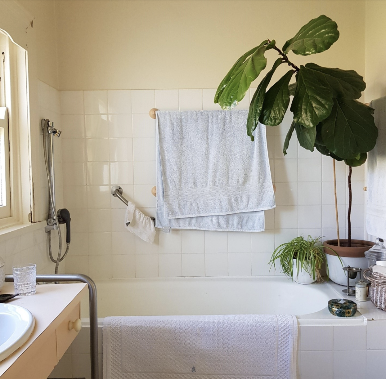
Before: Our seriously embarrassing and dated bathroom (and meet Frank)
It’s not exactly the design look one would expect from me, right? I couldn’t agree with you more. However, we wanted to be sure of our bigger plan before proceeding with the whole thing (not small bits at a time), and quite honestly, we needed to save up. Starting a small business is not a great way to save money, but here we are 10 years later, and it’s finally my turn. Yay!
So, what were we working with here? The original tub is great for soaking, and yes, we are bathtub people, but not having a walk-in shower hasn’t made quick daily showering easy. Also note: the shower head is right next to a timber framed window, which has signs of water rot. Upon discovery, I promptly banned showering in this space, banishing my husband and myself to the other shower in the laundry room… via a trip outside. Going out there in winter was miserable.
Also, notice how the lower towel rail would dangle towels in the bathtub, so not at all usable. By the way, meet Frank the Fiddle Leaf Fig tree. After several near-death experiences in other spots in our cold Canberra home, he now thrives in this bathroom. It wasn’t my first choice for him, but I do like a plant in a bathroom — those hard surfaces need softening.
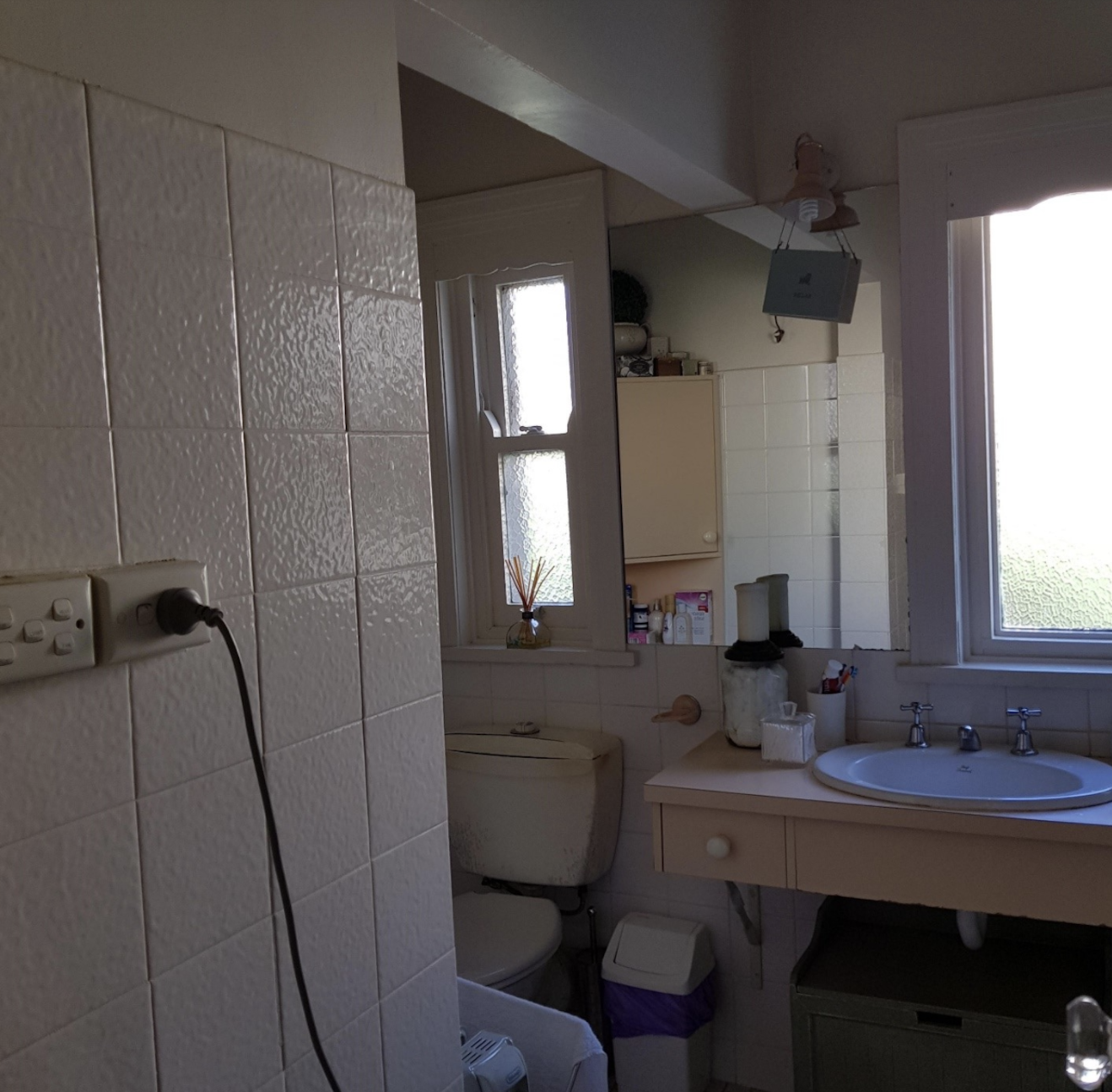
Before: Awkward power points and an off-center mirror
Wouldn’t it be a fun exercise to circle all of the things wrong with this space and see if you can guess them all? Ha. Apart from the dated apricot (well yes, things do come around again, but never quite the same, right?), there is some awkwardness going on…
When previous homeowners renovated this space in the early 70s, they opened up the wall of the toilet room to connect to the bathroom. It’s not the most attractive here, but it does make my bathroom bigger than many of my neighbours, who still have the original 1930s bathroom size, so I can see the benefits.
However, another weird thing going on is the mirror mounted left of the basin. It’s the only place they could have put it, right? We got used to it, but it never looked pretty. And who wants to apply mascara over the toilet??
Last but not least, the most egregious error, that light slight and power point right in the middle of the wall. It absolutely does my head in. I see it time and time again, new builds included. If owners don’t put thought into things or hire a designer, if left uninstructed, electricians seem to put these things in the most prominent places. Please, no. Can’t we all agree that switches are not works of art?
Grab Your Design Project Planner
Cut through the fluff to discover what you REALLY want done around your home.
This planner helps you prioritise your goals and create an action plan to proceed with design confidence.
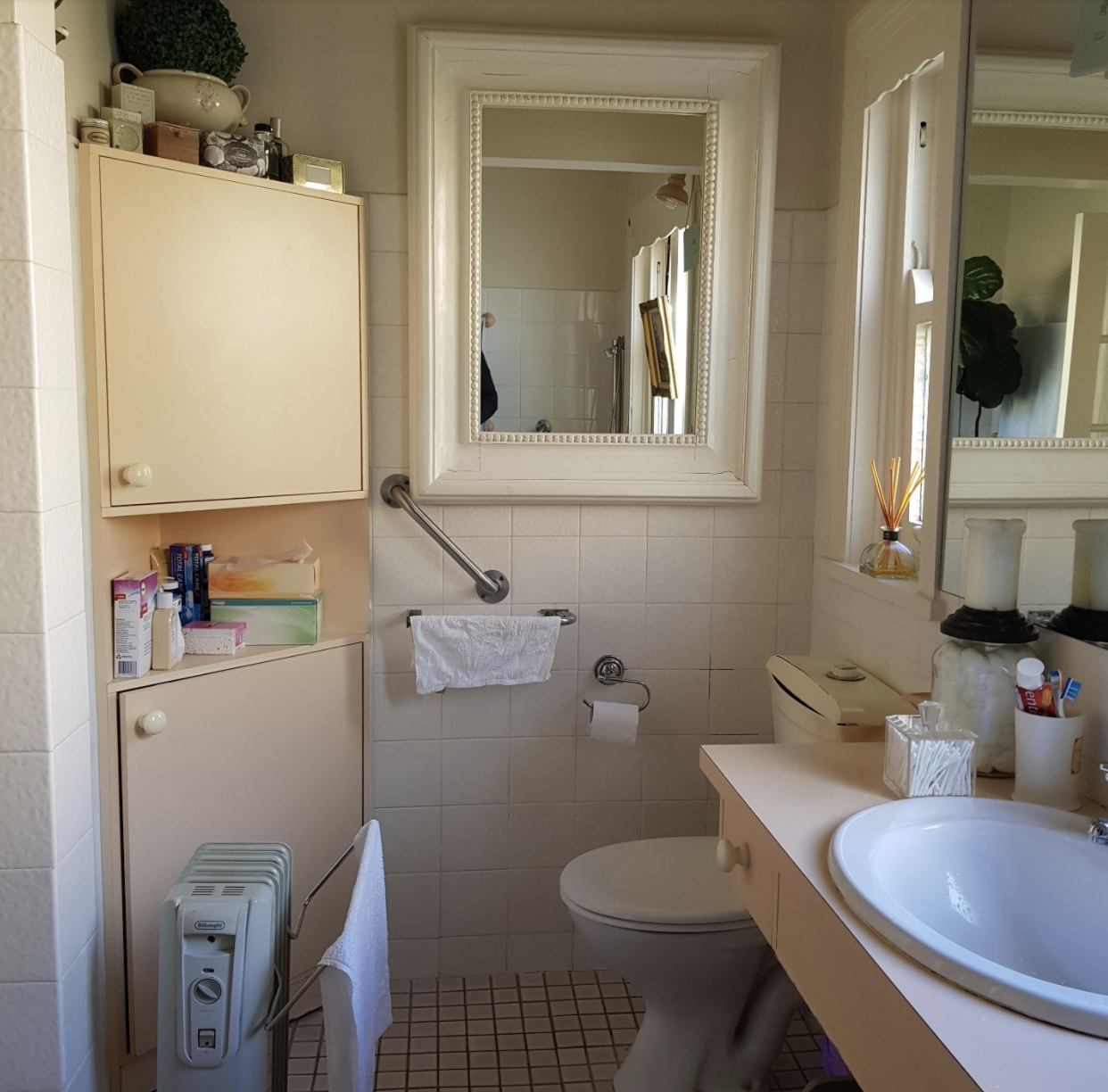
Before: Pink, apricot, and two shades of white?
Then there’s this charming view. Note the roll away heater… bills, bills, bills. If you look carefully, we even have two different white wall tiles. It completely looks like they just ran out. Also, pink floor tiles with apricot joinery? Why??
At least we were never short on storage in this old bathroom. In fact, I culled 50% of our bathroom cupboard content when we emptied the space before the renovation, including an overload of crap thanks to hubby’s Doom’s Day prepping. It’s clutter we certainly won’t miss. I also liked the feel of small tiles under my feet, which is something I carried over to the new design (though definitely with new, classic tiles).
I should point out that this bathroom is about 50 years old, so I would like to plug the old boring Laminex and say that it really did stand up from a wearability perspective. The Ideal Standard basin was still in perfect condition, too. I might even recycle it if we build a studio one day.
Next stage of the original 1930s bathroom renovation
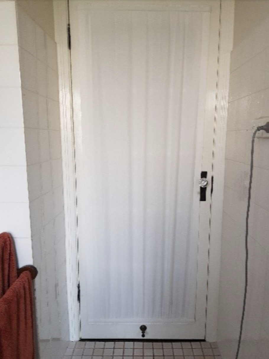
Last but not least, I changed the bathroom door to a glass French door with a soft sheer curtain when we moved in 10 years ago. I still love it, but it’s definitely worth changing the door swing to create more space.
So, that’s all for today. This was the starting point of our original 1930’s bathroom renovation. Quite a lot to tackle in this project, right? I genuinely cannot wait to show you the final photos of this space, but to keep this post from becoming a novel, I will save those for another day…
Until then, you can browse some of the design inspiration for my original 1930s bathroom renovation here, or download our Build Project Design Organiser here to start pulling together your own forever home.
Until next time,
Nadine
This is blog 2 of 8 in the Bathroom Renovation series. Click below to navigate through the series.

